Saturday 31 October 2009

Using Texture


This exercise was all about using line and other mark making techniques to convey different surface textures.

I enjoyed doing this exercise, and loved looking at different objects and using different media and different tools to try and describe what the texture looked like on paper.


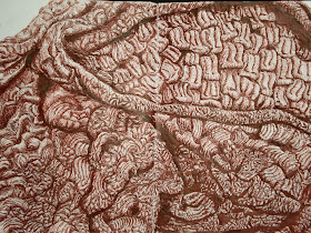
I chose to draw a thick blanket i had to draw for one of my larger texture drawings, i thought it had a very interesting look about it with really thick wool all through it. I used a double page in my sketchbook for this drawing, which i think sometimes makes a drawing more interesting just by doing that, and also used Indian red ink.
I think it turned out quite well, better than what i was expecting anyway, i had chosen a close up section of the blanket and filled the pages with it so i also think it would be hard to tell what it was if i didn't give a description. But i kind of like that about it as well, being unsure of what it is or what it is meant to be and just looking at what i was trying to achieve - the texture of the object.

Saturday 12 September 2009

Still Life


Using this exercise was a good way to experiment with different compositions, there was two parts to this exercise - man made objects and natural objects.
Creating an interesting composition was one of the objectives for this exercise, using thumbnail sketches in my sketchbook i was able to experiment with different compositions and viewpoints etc.
I like it when the subject(s) fill the page, and sometimes being so big that it is cropped by the edges of the page. I also like it when the subject is placed off centre. Drawings that spread across two pages give another interesting aspect to drawings.
The brief also suggested trying different sizes of paper like a square or circle rather than using a rectangle all the time. I found that the subject itself played a major role in choosing what size of paper and what type of composition i decided on using. For example a clove of garlic looked good in the centre of a square piece of paper, while i liked how the composition of a mushroom sliced in half looked being off centre on and cropped off a rectangular piece of paper.

After doing the thumbnail sketches i chose a few of the compositions i thought worked best and developed them into larger more finished pieces.


Sunday 30 August 2009

Reflected light

I found the reflected light exercise hard to get into as i find it harder to draw man-made objects and prefer natural forms. But once i began a few drawing i began to get more confident with what i was drawing and decided to try a pencil study of two aftershave bottles before i move on to the larger charcoal drawing. One bottle was more of a simple rectangle shape while the other had a curved back. I thought as they were both glass and also had different shapes it would make an interesting and challenging drawing.
I think this one turned out much better than what i thought it was going to when i started the drawing and i managed to get a reasonable 3-D effect and also the 'look' of glass and a shiny reflective surface.

Thursday 13 August 2009

Shape and Form


The basic shapes exercise involved drawing the basic shapes which together make up most of the objects and environment around us, these shapes are: a circle, an ellipse, a square an oblong and a triangle. After drawing these basic shapes and in turn finding all the basic shapes within everyday objects and how they together make up the overall shape of that object, it is then possible to created the illusion of form, so a square becomes a cube, a circle a sphere, an oblong a cylinder and a triangle a cone.
I found this exercise to be very useful as it helps to train your eye to look at familiar and unfamiliar objects in a new way as you try to pick out the different shapes which make up the whole object. I also enjoyed practicing with giving these shapes the illusion of form and found that it was much easier than I first anticipated. By using overlapping shapes to create distance and using various softness of pencils to create shadow and light I found it quite easy to create a convincing 3-D shape.
This drawing of a pepper was done with a dipping pen and ink, using hatching and cross hatching to create light and shade and also having a completely black background helped to give this drawing a 3-D effect. Allowing the white of the paper to come through gave a stark contrast with the black ink, making the pepper stand out.

Wednesday 5 August 2009

Dolly Mixtures

I saw a postcard with a bag of dolly mixtures on it and thought it would make an interesting and unusual drawing. I decided to use it for the tone and form exercise as i thought doing it in black and white would make it even more unusual as dolly mixtures are so colourful.
I drew it with a dip pen and ink (again!) it took forever, especially the sugar covered ones, but i think the ink gives a nice effect.


'sweeties' by Howard Shooter 2009


Sunday 2 August 2009

Tone and form

The tonal studies in this exercise has been one of my favorite parts of the course so far. I love working in black and white and since i began the course dipping pen and ink has become one of my favorite mediums to work in.
The first tonal study i did was of an orange cut in half, i think it turned out ok but not as well as what i had hoped.

The second tonal study i did was of three peppers, i think this one turned out much better than my first drawing. I decided to take photos of each stage of the drawing, i like that idea as it can give other people and myself a chance to see how the drawing progressed at different stages. Again i did this study in pen and ink.

Stage one:


Stage two :

The finished drawing :


Markmaking techniques


To practise different markmaking techniques i drew lots of 5cm squares on some A3 paper and used different mediums in each square, and as many different ways of making marks as i could think of. I then cut out a few of these squares and stuck them in my sketchbook, i decided to give each different medium its own page.

I liked doing this exercise, i was surprised at how many different ways i could make marks and with all the different media. I ended up doing more squares than i originally planned as i kept thinking of new techniques and new ways of using each media.

Assignment one: Markmaking and tone


The first exercise in this assignment is markmaking, i first heard of markmaking when i began to study art at A-level. At first i wasn't sure what i was meant to be doing exactly, it was never fully explained and everyone else in the class seemed to know what they were doing. Looking back of course i find it funny that i felt so lost as markmaking was simply making marks.

While back then i really didn't enjoy markmaking at all i have found that doing the exercise with the OCA course was actually very enjoyable. I like the freedom it brings when you are not concentrating on creating any particular picture but are just experimenting with different materials and mediums to see how many different marks can be made and in how many different ways.


Using a pen and ink to doodle ended up producing a sort of landscape drawing although i was not consciously planning on drawing anything in particular. The two ink sketches mounted on purple paper were created by applying ink on some paper then blowing through a straw over it, the second drawing also had some ink applied with a small piece of card, it also reminded me on a landscape drawing - the card producing mountains, hills and some grass coming up and the inkand straw making what looks like branches of tress coming across.

The next part of this exercise was to continue doodling but to allow a subject to influence the marks that were being made without trying particularly hard to produce any clear image.

The first picture was done in oil pastel and i used flowers as my subject, the main focous became an opening bud of a flower and the background became the grass surrounding it. The second picture was done using a cotton bud to apply ink, and i used water as my subject. It started out as being something like droplets of water falling down the page but when i finished i thought it also looked like unopened buds of a plant.

Saturday 1 August 2009

OCA

I finally began working towards a BA Hons Degree with the OCA. I have enrolled on the Drawing course and hope to continue and study the art history and painting courses that are available to gain the credits i need for the degree.
Part of the course is to keep a learning log and that is what i am using this blog for, as a record of my own creative development and journey as i progress through the course.
I have studied art at GCSE and A-level and also started a diploma in foundation studies in art and design but had to leave due to illness. I hope to become a better artist while studying with OCA and to have a better understanding of art. I hope to become a professional artist some day and be able to make a living from my art.